You get to see amazingly creative logos everywhere but have you ever wondered what magic these logos can do for you … the better a logo, greater the probability that your clients will remember you and get back to you.
In this era of advance technology, logo designing has now evolved in a more resourceful and inspiring way.
While browsing the net in logo design categories I cannot stop myself from appreciating the creative approach of today’s designer mind. Instead of posting a long list, I simply picked up best 15 logos, which tell you how much hard work and effort designers put in to come up with creative and unique logos.
Let us get inspired and appreciate the aptitude and creativity of talented logo designers.
1. BarCode
The logo tell us that a cup made from Barcode, then a cup full of drunk thing like in the Bar, so that its call BarCode.... (very creative)
2. "E" and "D" (ED Logo: Gianni Bortolotti)
"E" and "D" and an electric plug at the same time , awesome
Designer – Josiah Jost
The designer of ED Logo – “Elettro Domestici -Home Appliances” in English, changed the concept of traditional logo designing through this logo. The designer has amazingly used the negative space to demonstrate the letter “E” and “D” making the logo look like an electric plug.
3. Wine SearcherThe designer of ED Logo – “Elettro Domestici -Home Appliances” in English, changed the concept of traditional logo designing through this logo. The designer has amazingly used the negative space to demonstrate the letter “E” and “D” making the logo look like an electric plug.
to look for something we use glasses, the logo look like eye glasses and the eye glasses look like a couple botle of wine..... ( very smart...)
4. Boot
the boot letter in a boot shoes
5. Yoga Australia
the Body look like Y Letter mean Yoga.....At first glance the logo may look like a simple picture of a young girl doing her yoga exercise but if you watch it carefully the body posture is creating the Australia Map.
6. Bison Logos
a Logo for bison in the shape of bison, pretty cool
7. CFO
A logo for CFO cycling team
8. Ukraine's Consumer society and citizen Network
A logo for Ukraine's Consumer society and citizen Network, they need Umrella to protect themselves from the barcode rain....
9. Water Empire Logo
can you imagine...??? what dyou opinion????
10. ZIP Logo
Designer – Mike Erickson
Zip – The “I” has been replaced with a zipper to connect the Z & P
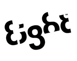
11. Eight Logo
This logo is too good to be ignored….it is very cleverly designed with a typeface where every letter is a variation of number 8. Nothing better have been thought.
12. Big Ten Logo
The Big Ten collegiate conference has eleven schools but they didn’t want to change their name. However, they used their logo to hide the numerical “11” in the name.
13. Fashion Center
The logo pictures look like a shirt button , theres A Letter "F" meaning Fashing just look like a hole of shirt button for thread
14. More Than Logo
No need to explain , yeah...... you must know this one...
15. Killed Production
look the letter "I" he got killed by someone ( very funny ..)
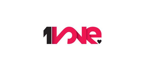
16. One 2love
One 2love logo , its complicated , theres Number 1 besides Number 2 , number two looks like a letter "L" and "O" or the letter "L" and "O" looks like Number two, whatever. I just wanna tell u, its very clever...and amazingly . the logo explain the One who to Love.
TO BE CONTINUED........


No comments:
Post a Comment